THE MAGIC COUPLE
Here you have books with the classic male/female team up. Magic swirls and sparks around the man's hand, identifying him as the big, strong, magic weilding hero, while the female stands just behind him, shielded by his magical experience it would seem. There is a gritty, shadowy feel to the colouring, as if a film covers the scene, setting the scene before the first word is even read.
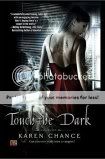
OH, LOOK! SHE HAS A BACK!
A lovely new trend where kickass heroines are shown before desolate landscapes with a post-apocalyptic feel to them. The heroines are dressed in skin-tight dresses (usually black) with low or no backs, a hand or two visible, their head/face kept out of shot or turned away. I can appreciate that; the idea likely being so that you can use your own imagination or insert yourself as the heroine. Bars of solid colour across the top, coordinated with the landscapes, provide space for the author's name or the book's title to be written. Interestingly, in this case, Caine's book was released November '05, Harrison's June 'o6, just seven months between.
NOT WORTH LOOKING AT
Continuing with the same reader-insert/imagination concept, there are covers which show their female lead with their back (covered this time) to the reader and weapons often in hand, as they peer forward in the direct their adventures, their story. I like to think it's as if the heroine is posed set to start in on the story, ready to undertake her adventures every time the book is opened.
SOMETHING YOU SHOULD SEE
Again the heroine has her back to the reader, but now her face is turned slightly towards the side, almost as if she's trying to see the reader from the corner of her eye. In these instances, she stands before windows, both standing indoors and yet in darkness as though in the act of searching, and each carries a characteristics that hint at the plot; Mercy holds a book, Cassie stands in tendrils of ghostly smoke. The...point though is that these women are posed, their clothing designed, specifically to allow the tattoos on their backs to be seen.
THE SMOLDERING STARE
Wrapped in a passionate embrace with their lovers, these male vampire/female human pairings have someone a little more interest in fixing the reader with a sexy, come hither stares - hers with an innocent, virgin air further inferred by her white gown and stark contrast to her pale, all-in-black vamp boytoy, his with a feral and possessive edge that's only intensified by his partner's apparently willing offering of her neck. Both are set against essentially solid-coloured backgrounds with the clothing being likewise simplistic which only serve to give more forcus to those stares. Don't they just give you chills?
LET'S BE CLEAR: THIS IS A ROMANCE
So, just in case there was any confusion, doubt or misunderstanding regarding a book's romantic element there is nothing that clears it up more than the main characters in mid foreplay right there on the cover. Really, what more is there to say on this?
Obviously there are tons of other variations, but you get the idea. My final observation is the trend in the covers of a series.
A SERIES


Common to all the covers is a lion visible only from the head to about his shoulders and a red-haired girl weilding a sword with some indication of the book's setting seen in the background. The similarities in the covers allows for a easy, visible association of the books as belonging together - something particularily useful should there be no handy note made on the books (FYI: I HATE it when serial books failed to have their series title printed somewhere on the books and I bow to Orbit Publishing for not only writing it on the cover AND the spin, but for numbering the books as well. INGENIUS! If the other publishers would follow suit, it would be perfect!)


3 comments:
Agreed. the books used to be so distinctive that you almost knew who the author was just by the cover. Now they are all the same.
I just saw Pride and Prejudice & Romeo and Juliet at the bookstore with new Twilight inspired covers...black with red/white roses.
My pet peeve is when the book becomes a movie/TV show and they put new covers with actors instad or stick a label on it. I'm thinking of the True Blood - Sookie Stackhouse books. All the new books have that annoying True blood label over the really unique artwork of the cover!! arghhh
AND - yes, please label your books in the series people! whew...ok I'm done :-)
Karen
Well said. You forgot to include the romcoms with their cheerful colours. Highlighter pink, green, yellow... So happy. : )
Thank you for taking the time to write this
Post a Comment